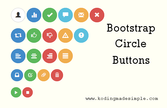
Hi, here comes another nice addition to our twitter bootstrap tutorials series. This post discusses about customizing/extending bootstrap features and let you create circle/round buttons with bootstrap 3 css. Bootstrap provides seven different button classes of varying color and they are rounded rectangle by default. These button classes provide an excellent base structure for designing your own styles. You will be amazed to see how very little css code could create beautiful circle buttons.

How to Create Circle Buttons in Bootstrap
Creating circle buttons with bootstrap is lot easier than you think. A few css tweaks and you are done. As an example let’s design some round buttons with icons. For icons, we’ll use glyphicons that comes with bootstrap. These glyphicons are high quality scalable font icons and you can pretty much use them with small to larger size buttons without losing its quality.
In Bootstrap you are allowed to create buttons in four different sizes with its classes ‘.btn-lg’ (large), ‘.btn-sm’ (small), ‘.btn-xs’ (extra small) and default size without using any specific class.
Now let us create a separate button class ‘.btn-round’ for round buttons. By this way you can also make use of the default bootstrap rounded corner buttons. To make the buttons a perfect circle we should set it’s width and height equal and ‘border-radius’ to 50% to get complete roundness around the edges.
Don’t Miss: How to Create Carousel Image Slider in Twitter Bootstrap
CSS Styles for Bootstrap Circle Buttons
.btn-round {
    width: 40px;
    height: 40px;
    border-radius: 50%;
}

.btn-round.btn-lg {
    width: 48px;
    height: 48px;
}

.btn-round.btn-sm {
    width: 34px;
    height: 34px;
}

.btn-round.btn-xs {
    width: 24px;
    height: 24px;
}
Having the css in place let’s write the html markup to create bootstrap circle buttons.
HTML Markup for Bootstrap Circle Buttons
<!-- large buttons -->
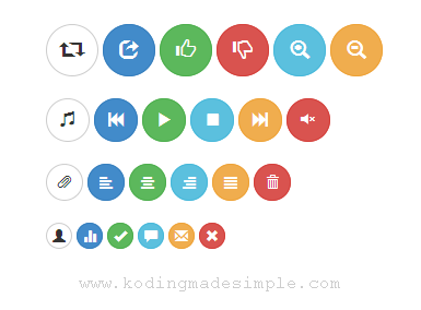
<button type="button" class="btn btn-default btn-lg btn-round"><span class="glyphicon glyphicon-retweet"></span></button>
<button type="button" class="btn btn-primary btn-lg btn-round"><span class="glyphicon glyphicon-share"></span></button>
<button type="button" class="btn btn-success btn-lg btn-round"><span class="glyphicon glyphicon-thumbs-up"></span></button>
<button type="button" class="btn btn-danger btn-lg btn-round"><span class="glyphicon glyphicon-thumbs-down"></span></button>
<button type="button" class="btn btn-info btn-lg btn-round"><span class="glyphicon glyphicon-zoom-in"></span></button>
<button type="button" class="btn btn-warning btn-lg btn-round"><span class="glyphicon glyphicon-zoom-out"></span></button>

<!-- default size buttons -->
<button type="button" class="btn btn-default btn-round"><span class="glyphicon glyphicon-music"></span></button>
<button type="button" class="btn btn-primary btn-round"><span class="glyphicon glyphicon-fast-backward"></span></button>
<button type="button" class="btn btn-success btn-round"><span class="glyphicon glyphicon-play"></span></button>
<button type="button" class="btn btn-info btn-round"><span class="glyphicon glyphicon-stop"></span></button>
<button type="button" class="btn btn-warning btn-round"><span class="glyphicon glyphicon-fast-forward"></span></button>
<button type="button" class="btn btn-danger btn-round"><span class="glyphicon glyphicon-volume-off"></span></button>

<!-- small buttons -->
<button type="button" class="btn btn-default btn-sm btn-round"><span class="glyphicon glyphicon-paperclip"></span></button>
<button type="button" class="btn btn-primary btn-sm btn-round"><span class="glyphicon glyphicon-align-left"></span></button>
<button type="button" class="btn btn-success btn-sm btn-round"><span class="glyphicon glyphicon-align-center"></span></button>
<button type="button" class="btn btn-info btn-sm btn-round"><span class="glyphicon glyphicon-align-right"></span></button>
<button type="button" class="btn btn-warning btn-sm btn-round"><span class="glyphicon glyphicon-align-justify"></span></button>
<button type="button" class="btn btn-danger btn-sm btn-round"><span class="glyphicon glyphicon-trash"></span></button>

<!-- extra small buttons -->
<button type="button" class="btn btn-default btn-xs btn-round"><span class="glyphicon glyphicon-user"></span></button>
<button type="button" class="btn btn-primary btn-xs btn-round"><span class="glyphicon glyphicon-stats"></span></button>
<button type="button" class="btn btn-success btn-xs btn-round"><span class="glyphicon glyphicon-ok"></span></button>
<button type="button" class="btn btn-info btn-xs btn-round"><span class="glyphicon glyphicon-comment"></span></button>
<button type="button" class="btn btn-warning btn-xs btn-round"><span class="glyphicon glyphicon-envelope"></span></button>
<button type="button" class="btn btn-danger btn-xs btn-round"><span class="glyphicon glyphicon-remove"></span></button>
The above markup will produce nice set of round buttons with icons.

As I wish to stick to the basic button styles of bootstrap I didn’t bothered to change their behavior such as color, background or hover styles. But you can if you want. Go ahead. Don’t limit yourself with the icons given here. Glyphicons contains more than 250 icons and you can check here for the complete list of glyphicons available in bootstrap.
Read Also:- How to Add Login Form to Bootstrap Navigation Menu
- Create Working Bootstrap Contact Form with Validations
If you want to use text with icons in bootstrap buttons then check out this bootstrap tutorial.

Hey, great article Valli. Is there a way to implement these classes in the navigation forexample, to have a nice three large buttons in the middle of the page. Many thanks.
ReplyDeleteHi Thanks for that I was looking for those buttons.
ReplyDelete