Hi, we'll see how to add icon to search box in twitter bootstrap in this tutorial. It's just one of the unspoken rules of modern web design to include search box on every websites and blogs out there. Especially for content rich sites, having a search box on top will help the users to dig out the archives for the right information. Generally including a search bar on a website's top navigation menu is easy on the eyes. I am not going to discuss here about adding a search bar on bootstrap's navigation bar. As that topic had been already covered in this bootstrap navbar tutorial.
Typically adding a text box along with a search button may just fills out the purpose of a search box but it's sort of old school. So either we can go off without a visible submit button or with a search icon at the end of the search box. We'll better stick on to the latter option here.
Read:- Change Bootstrap Navbar Color, Text & Hover Color
- Multi-level Vertical Dropdown Menu with Bootstrap
- Highlight Table Row OnClick/Hover with Bootstrap
The challenge here is to add a clickable search icon to the end of the search bar that looks great and properly aligned on both desktop and mobile screens. So the best way is to append the icon to the search textbox. In simple terms my idea is to create a bootstrap search box that looks something like this.
| Bootstrap Search Box |
Bootstrap provides an add-on component called "input-group" that can be used to extend text-based input controls by adding text or buttons before, after or on both sides of the form control.
We are going to use this "input-group" add-on to add a submit button at the end of the text box in the search bar. But the submit button will hold a search icon (from glyphicons) instead of text and by this way we get a clickable icon.
Twitter Bootstrap Search Box with Icon in Navbar:
Let's see how to create bootstrap search box with icon in navbar. You need to load both bootstrap's css and js files in the html file for the navigation menu to work. The bootstrap javascript file is required to show and hide the menu section when navbar is collapsed on devices with smaller screens (like tablet, mobiles).
STEP-1) First make the web page responsive by adding this meta tag to the html file.
<meta name="viewport" content="width=device-width, initial-scale=1.0" />
STEP-2) Next include the bootstrap css file within the <head></head> section of the html.
<link href="/path/to/bootstrap.css" rel="stylesheet" type="text/css" />
STEP-3) Load the bootstrap javascript and jquery library just above the closing body (</body>) tag.
<script src="/path/to/jquery-1.10.2.js"></script>
<script src="/path/to/bootstrap.js"></script>
Just make sure you load jquery file before bootstrap js file for it to work.
Note: I have included the non-minified versions of css and js files as this is for development. But remember to use minified versions on production environment.
STEP-4) Finally add the bootstrap navbar component itself. Here we add the logo and the menu items to the left of the navigation menu and the search box at the right side.
<nav class="navbar navbar-inverse" role="navigation">
    <div class="container-fluid">
        <!-- add header -->
        <div class="navbar-header">
            <button type="button" class="navbar-toggle" data-toggle="collapse" data-target="#navbar1">
                <span class="sr-only">Toggle navigation</span>
                <span class="icon-bar"></span>
                <span class="icon-bar"></span>
                <span class="icon-bar"></span>
            </button>
            <a class="navbar-brand" href="#">TravelZ</a>
        </div>
        <!-- add menu -->
        <div class="collapse navbar-collapse" id="navbar1">
            <ul class="nav navbar-nav">
                <li class="active"><a href="#">Home</a></li>
                <li><a href="#">About</a></li>
                <li><a href="#">Services</a></li>
            </ul>

            <!-- add search form -->
            <form class="navbar-form navbar-right" role="search">
                <div class="input-group">
                    <input type="text" class="form-control" placeholder="Search this site">
                    <span class="input-group-btn">
                        <button type="submit" class="btn btn-default">
                        <span class="glyphicon glyphicon-search"></span>
                        </button>
                    </span>
                </div>
            </form>
        </div>
    </div>
</nav>
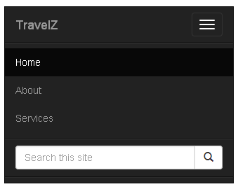
This markup will create a responsive navigation menu that looks best in both desktop and mobile view. Now this is how the navbar will look like.
 |
| Desktop View - Bootstrap Navbar Search Box with Icon |
 |
| Mobile View - Bootstrap Navbar Search Box with Icon |
From the above code, you can see we have created bootstrap inverse navbar with some menu items and search box with icon. Adding "navbar-right" class to the search form aligned it to the right side of the navbar element. To append the submit button to the textbox, we have wrapped up the <button></button> element inside the ".input-group-btn" class.
- Dynamic Image Gallery in Boostrap, jQuery & PHP
- How to Create Popover Form with Bootstrap & jQuery
- How to Customize Bootstrap Navigation Menu
That's all about creating bootstrap search box with icon in navbar. I hope you like this tutorial. Please don't forget to share it in social networks.

No comments:
Post a Comment