HTML Table Element displays your website data in tabular format but writing CSS styles of your own to improve the look and feel of those tables is definitely a headache. Never worry. Twitter Bootstrap CSS Framework comes to your rescue here. It provides a bunch of css classes to style the html tables. By using these bootstrap table styles along with the <table> tag you can greatly improve the appearance of the tables.
How to Use Twitter Bootstrap Table Styles in HTML
Bootstrap provides a base class named ".table" which adds default cell padding and horizontal dividers in-between rows of the table. To apply this style, just add the css class ".table" to the html <table> tag.
Example
<!-- basic style -->
<table class="table">
    <thead>
        <tr>
            <th>#</th>
            <th>Name</th>
            <th>Customer-ID</th>
            <th>Email</th>
        </tr>
    </thead>
    <tbody>
        <tr>
            <td>1</td>
            <td>John Pate</td>
            <td>AUSXYZ1481</td>
            <td>johnpate@mydomain.com</td>
        </tr>
        <tr>
            <td>2</td>
            <td>Gina Ray</td>
            <td>AUSXYZ2932</td>
            <td>ginaray@mydomain.com</td>
        </tr>
        <tr>
            <td>3</td>
            <td>Paul Smith</td>
            <td>AUSXYZ6381</td>
            <td>paulsmith@mydomain.com</td>
        </tr>
    </tbody>
</table>
Above markup will give you an html table like this.

Along with the basic table style, twitter bootstrap does provide optional table classes to extend the styles.
Recommended Read: How to Build Carousel Image Slider in Twitter Bootstrap
Recommended Read: Twitter Bootstrap Icons List and their Usage in HTML
Striped Table
To style a table with zebra striping rows you can add the style ".table-striped" along with the ".table" base class. This will add light gray background to alternative rows of the table.
Example
<!-- striped style -->
<table class="table table-striped">
    <thead>
        <tr>
            <th>#</th>
            <th>Name</th>
            <th>Customer-ID</th>
            <th>Email</th>
        </tr>
    </thead>
    <tbody>
        <tr>
            <td>1</td>
            <td>John Pate</td>
            <td>AUSXYZ1481</td>
            <td>johnpate@mydomain.com</td>
        </tr>
        <tr>
            <td>2</td>
            <td>Gina Ray</td>
            <td>AUSXYZ2932</td>
            <td>ginaray@mydomain.com</td>
        </tr>
        <tr>
            <td>3</td>
            <td>Paul Smith</td>
            <td>AUSXYZ6381</td>
            <td>paulsmith@mydomain.com</td>
        </tr>
        <tr>
            <td>4</td>
            <td>Darryl Rob</td>
            <td>AUSXYZ7264</td>
            <td>darrylrob@mydomain.com</td>
        </tr>
        <tr>
            <td>5</td>
            <td>Tina Michael</td>
            <td>AUSXYZ8330</td>
            <td>tinamichael@mydomain.com</td>
        </tr>
    </tbody>
</table>
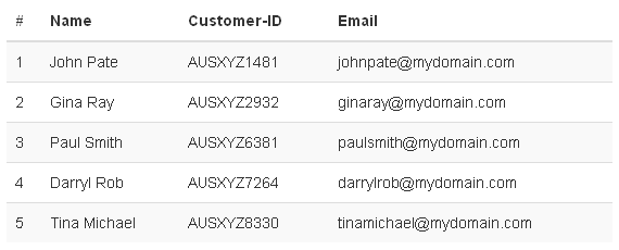
Note: Striped table styles are created using the CSS :nth-child selector and it won't work in IE8 or lower version.
Bordered Table
By using ".table-bordered" class you can add borders to all sides of the cells and table.
Example
<!-- bordered style -->
<table class="table table-bordered">
    <thead>
        <tr>
            <th>#</th>
            <th>Name</th>
            <th>Customer-ID</th>
            <th>Email</th>
        </tr>
    </thead>
    <tbody>
        <tr>
            <td>1</td>
            <td>John Pate</td>
            <td>AUSXYZ1481</td>
            <td>johnpate@mydomain.com</td>
        </tr>
        <tr>
            <td>2</td>
            <td>Gina Ray</td>
            <td>AUSXYZ2932</td>
            <td>ginaray@mydomain.com</td>
        </tr>
        <tr>
            <td>3</td>
            <td>Paul Smith</td>
            <td>AUSXYZ6381</td>
            <td>paulsmith@mydomain.com</td>
        </tr>
    </tbody>
</table>

Add Hover Style to Tables
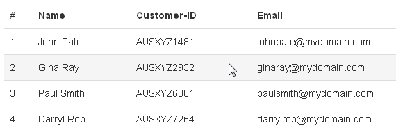
You can add hover styles to tables with the class ".table-hover". This will add a light gray background to rows on mouse over.
Example
<!-- hover style -->
<table class="table table-hover">
    <thead>
        <tr>
            <th>#</th>
            <th>Name</th>
            <th>Customer-ID</th>
            <th>Email</th>
        </tr>
    </thead>
    <tbody>
        <tr>
            <td>1</td>
            <td>John Pate</td>
            <td>AUSXYZ1481</td>
            <td>johnpate@mydomain.com</td>
        </tr>
        <tr>
            <td>2</td>
            <td>Gina Ray</td>
            <td>AUSXYZ2932</td>
            <td>ginaray@mydomain.com</td>
        </tr>
        <tr>
            <td>3</td>
            <td>Paul Smith</td>
            <td>AUSXYZ6381</td>
            <td>paulsmith@mydomain.com</td>
        </tr>
        <tr>
            <td>4</td>
            <td>Darryl Rob</td>
            <td>AUSXYZ7264</td>
            <td>darrylrob@mydomain.com</td>
        </tr>
    </tbody>
</table>
Condensed Table
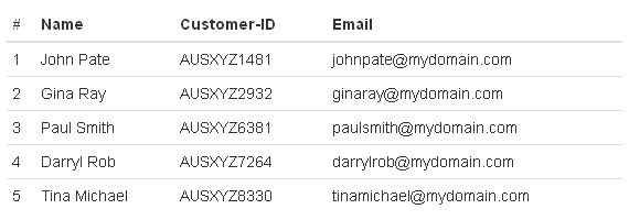
You can also make the tables look more compact by trimming extra padding space between the cells. Adding the class ".table-condensed" to the base class ".table" will make the table look denser by cutting off the cell padding by half.
Example
<!-- condensed style -->
<table class="table table-condensed">
    <thead>
        <tr>
            <th>#</th>
            <th>Name</th>
            <th>Customer-ID</th>
            <th>Email</th>
        </tr>
    </thead>
    <tbody>
        <tr>
            <td>1</td>
            <td>John Pate</td>
            <td>AUSXYZ1481</td>
            <td>johnpate@mydomain.com</td>
        </tr>
        <tr>
            <td>2</td>
            <td>Gina Ray</td>
            <td>AUSXYZ2932</td>
            <td>ginaray@mydomain.com</td>
        </tr>
        <tr>
            <td>3</td>
            <td>Paul Smith</td>
            <td>AUSXYZ6381</td>
            <td>paulsmith@mydomain.com</td>
        </tr>
        <tr>
            <td>4</td>
            <td>Darryl Rob</td>
            <td>AUSXYZ7264</td>
            <td>darrylrob@mydomain.com</td>
        </tr>
        <tr>
            <td>5</td>
            <td>Tina Michael</td>
            <td>AUSXYZ8330</td>
            <td>tinamichael@mydomain.com</td>
        </tr>
    </tbody>
</table>
Add Different Background Colors to Table
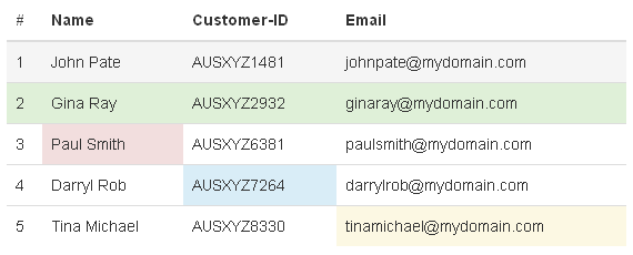
Bootstrap provides a handful of contextual classes to represent different types of actions like success, danger, warning etc. And they can be used to apply different shades of background color to table header (using in <th> tag), table rows (using in <tr> tag) or individual cells (using in <td> tag).
Example
<!-- colored style -->
<table class="table">
    <thead>
        <tr>
            <th>#</th>
            <th>Name</th>
            <th>Customer-ID</th>
            <th>Email</th>
        </tr>
    </thead>
    <tbody>
        <tr class="active">
            <td>1</td>
            <td>John Pate</td>
            <td>AUSXYZ1481</td>
            <td>johnpate@mydomain.com</td>
        </tr>
        <tr class="success">
            <td>2</td>
            <td>Gina Ray</td>
            <td>AUSXYZ2932</td>
            <td>ginaray@mydomain.com</td>
        </tr>
        <tr>
            <td>3</td>
            <td class="danger">Paul Smith</td>
            <td>AUSXYZ6381</td>
            <td>paulsmith@mydomain.com</td>
        </tr>
        <tr>
            <td>4</td>
            <td>Darryl Rob</td>
            <td class="info">AUSXYZ7264</td>
            <td>darrylrob@mydomain.com</td>
        </tr>
        <tr>
            <td>5</td>
            <td>Tina Michael</td>
            <td>AUSXYZ8330</td>
            <td class="warning">tinamichael@mydomain.com</td>
        </tr>
    </tbody>
</table>
Recommended Read: How to Build Contact Form in Bootstrap using PHP
Create Responsive Tables in Bootstrap
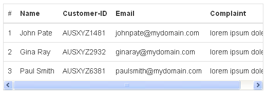
You can easily create responsive tables in bootstrap 3 and enable horizontal scrolling to tables on small devices under 768px wide. This will be very useful in responsive web designs and ads up horizontal scrolling to tables when viewed on mobiles and tablets. Granted you won't see any difference by using this class unless viewed on screens less than 768px width.
To make a table responsive, just wrap up any ".table" inside ".table-responsive". Here goes the example for doing it.
Example
<!-- responsive style -->
<div class="table-responsive">
    <table class="table">
        <thead>
            <tr>
                <th>#</th>
                <th>Name</th>
                <th>Customer-ID</th>
                <th>Email</th>
                <th>Complaint</th>
            </tr>
        </thead>
        <tbody>
            <tr>
                <td>1</td>
                <td>John Pate</td>
                <td>AUSXYZ1481</td>
                <td>johnpate@mydomain.com</td>
                <td>lorem ipsum dolem</td>
            </tr>
            <tr>
                <td>2</td>
                <td>Gina Ray</td>
                <td>AUSXYZ2932</td>
                <td>ginaray@mydomain.com</td>
                <td>lorem ipsum dolem</td>
            </tr>
            <tr>
                <td>3</td>
                <td>Paul Smith</td>
                <td>AUSXYZ6381</td>
                <td>paulsmith@mydomain.com</td>
                <td>lorem ipsum dolem</td>
            </tr>
        </tbody>
    </table>
</div>
This is how the responsive table will look like (with horizontal scroll bars) in mobile, tablet screens (< 768px).
And that explains about various bootstraps table styles and their usage in web projects.
Though you can use the default css components for your web development task, you can easily customize bootstrap css to fit your requirement. Take a look at our bootstrap tutorials section to get start with it.

No comments:
Post a Comment