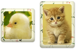
Turn your plain website/blog images into an eye candy thing. CSS can be used to apply stylish image effects. Here is a pure CSS trick to apply photo frame effect to images. No need to completely rely on Photoshop to enhance the appearance of images anymore.
Here are the advantages of using css for image effects:
- There is no need for any image processing software.
- No image customization required. This CSS style can be used to any image irrespective of its size and type.
- Don't want to worry about positioning the images; and it maintains the image aspect ratio.
- The CSS styles can be tweaked later to suit your needs without bothering the html pages.

How to Create Photo Frame Effect with CSS?
To pull off the photo frame image effect, we just wrap our <img> tag inside a <div> block. Add a background texture image using "background" property to serve as a photo frame. To make it realistic, we add some "box-shadow" which makes the edges to look like a real photo frame. Now set the width alone to the <div> and <img> to maintain the image aspect ratio*. Center the image both horizontally and vertically inside the div. Now we are done. Wait! Wait. To boost up the beauty of the image, we round the corner of both the <div> and <img> tags. That's it.
Recommended Read: How to add a semi-transparent color layered text over an image using pure CSS
Recommended Read: How to Create Round Social Media icon style buttons using CSS
The resulting image will look like either rectangle or square based on the image width and height.*Aspect Ratio = Image-Width/Image-Height, and will be 1 for square image.
Create Square/Rectangle Photo Frame Effect
 |
| Square/Rectangle Photo Frame Effect using CSS |
To get this effect we add a flat border radius of 20 px to all the four corners of both <div> block and image.
HTML Markup
<div class="squareFrame">
     <img src="images/kitten.jpg" />
</div>
CSS Code
.squareFrame{
      background: url("images/floral.jpg");
      margin-left:auto;
      margin-right:auto;
      display:table-cell;
      position:relative;
      overflow:hidden;
      width:300px;
      box-shadow: inset 0 50px rgba(255,255,255,0.1),
             inset 2px -15px 30px rgba(0,0,0,0.4),
             2px 2px 5px rgba(0,0,0,0.3);
      padding: 25px;
      border-radius: 20px;
      -webkit-border-radius: 20px;
      -moz-border-radius: 20px;
      vertical-align: middle;
      text-align:center;
}

.squareFrame img{
     width: 300px;
     border-radius: 20px;
     -webkit-border-radius: 20px;
     -moz-border-radius: 20px;
}
Create Round/Oval Photo Frame Effect
 |
| Round/Oval Photo Frame Effect using CSS |
In order to make the frame completely rounded, we set the border radius to 50%. If we use square image we get a perfect round else get an oval shaped frame effect.
HTML Markup
There is not much difference in html except the class name.
<div class="roundFrame">
     <img src="images/kitten.jpg" />
</div>
CSS Code
.roundFrame{
     background: url("images/floral.jpg");
     margin-left:auto;
     margin-right:auto;
     display:table-cell;
     position:relative;
     overflow:hidden;
     width:300px;
     box-shadow: inset 0 50px rgba(255,255,255,0.1),
           inset 2px -15px 30px rgba(0,0,0,0.4),
           2px 2px 5px rgba(0,0,0,0.3);
     padding: 25px;
     border-radius: 50%;
     -webkit-border-radius: 50%;
     -moz-border-radius: 50%;
     vertical-align: middle;
     text-align:center;
}

.roundFrame img{
     width: 300px;
     border-radius: 50%;
    -webkit-border-radius: 50%;
    -moz-border-radius: 50%;
}
Note: Please note that the image border radius is not supported by older versions of browsers and in that case just make the div's "border-radius" to minimum or just use the image as a background for <div> block using "background" property.
Recommended Read: How to add Stunning 3D CSS Photo Frame Effect to Images
Recommended Read: Create a stylish Horizontal Menu Bar with HTML and CSS
Conclusion
I have implemented the styles as CSS class which will be easier to apply for multiple images. All you have to do is just copy paste the above code and give a novelty look to your website/blogs. Want to learn more tricks like this? Then subscribe to our RSS feed. Finally, if you find this post useful, please kindly share it in your circle :).

No comments:
Post a Comment